
Summary in 30 Seconds
When I interned at Mastercard Product team in July 2024, I was responsible for enhancing Mastercard WeChat Mini Program browsing experience from scratch.
First Things First: What is WeChat Mini Program?
WeChat mini programs are compact applications integrated within WeChat without the need for separate downloads. Mastercard utilizes this platform to host its loyalty programs, providing users with direct and secure access to exclusive rewards and offers through WeChat.
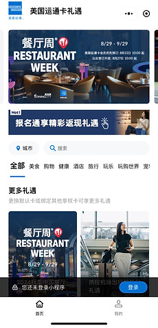
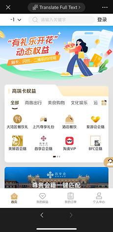
Overview of Current Key Screens


Problem
Mastercard Mini Program users currently face difficulty in accessing and redeeming the loyalty rewards
-
Difficulty in recognizing the brand associated with rewards
-
Challenges in matching rewards with their specific credit card tier
-
Uncertainty in confirming the status of reward redemption
Solution
Streamline the rewards discovery and identification decision process
-
Redesign the rewards UI card to make it easier to identify brands.
-
Revise the display mechanism to clearly match rewards with corresponding credit card levels.
-
Implement a unified color scheme that allows users to easily track their reward activities.
Disclaimer: Due to confidentiality agreements with Mastercard, I am unable to display the full final design of the WeChat mini program interface. The information provided here is a general overview intended to showcase the design process and my contributions to the project. Thank you for understanding the limitations placed on this content.
Design Saga

Current User Journey

Insights from User Journey
Focusing on the user journey, I identified the most pressing concerns:
Users currently cannot search rewards by category or keyword
Time Consuming
Users struggle to identify reward brands without accessing detailed pages
Lack of Brand Recognition
Cannot directly see rewards corresponding to different credit card levels
Lack of Clarity in Matching Reward
Users are hard to tell reward eligibility due to the gray redeem button
Confusion on Redeem Status
User Interviews
I interviewed 6 individuals who had used Mastercard WeChat Mini Program to understand their navigating experience.
Findings
5/6
Reported difficulty matching rewards with credit card levels
"All the rewards are in one section. I need to read through the whole paragraph to find the one matching my card."
4/6
Requested clear brand display on each reward card
"Some images and titles on the homepage are kinda random. I don’t know which brand it is without clicking in."
3/6
Felt the excessive use of theme color on some pages
"I understand orange is Mastercard’s theme color, but some pages just overuse it, which is overwhelming."
3/6
Wanted a filter feature on homepage
"I have to check everything till I find the reward type I'm interested in."
Competitive Research
Always learn from our competitors.
I conducted competitive research on 2 direct and 1 analogous competitors to understand how they design their reward pages to enhance user navigation and information accessibility.
Research Insights

Direct Competitor 1
Clean Interface Design with a Unified Theme Color
The homepage of the Amex features a simplified color scheme--a deeper shade of its signature blue paired with white, which promotes a clean design aesthetic and enhances accessibility through effective color contrast.
Multiple Filtering Options
Amex provides multiple filtering options on its homepage including location-based filters, a search bar, and category selections that streamline the process of searching for rewards.

Direct Competitor 2
Clarity on Brand
UnionPay utilizes both brand logos and text to clearly communicate brand identity, ensuring users can easily recognize and connect with brands.
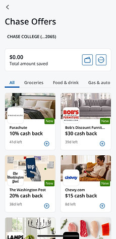
Analogous Competitor
Comprehensive Reward Information on Each Card
The Chase App presents detailed reward information on each card, helping users make informed decisions efficiently.
Design Conceptualization
My Observation + User Insights + Research Insights, now it's time to put things together.
Oh, wait! I need to call product and development teams too!
Design Suggestions
Visual Cues
Simple Design
Clear Guide
Business Considerations
Business Needs
Engineering Contraints
Time Cost
Narrowing Down
1
New UI card for Improved Brand Visibility and Interaction


*Note: The design was originally created in Mandarin Chinese
Hard to see brand logo
No action button
Distinguishable logo
Action button encouraging interaction
2
Interactive Display Mechanism for Reward Pairing


*Note: The design was originally created in Mandarin Chinese
Excessive information overload
No correspondance between credit card and reward
Brief but efficient instruction within one screen
Action button encouraging interaction
3
Unified Color Scheme for Visual Coherence for Reward Redeem Status


*Note: The design was originally created in Mandarin Chinese
Overuse of the thematic colors
No consolidated design system
Utilize the thematic orange color exclusively for key action buttons
Coherent design system across screens to reduce cognitive load
A/B Testing and the Winner goes to...
To validate the design improvements, I conducted A/B tests to see how users perceive this new experience
Research Quesion 1
Would it help customers find desired rewards faster?
Research Quesion 2
Would users find the CX intuitive?
6
Participants: GenZ x2 | Millennials x 2 | GenX x 2
Like it? Want more info? Here we go!
Users can instantly identify product information with a quick camera scan. A pop-up message then directs them to the product page.
Impact
The project was successfully presented to my manager and my mentor.
My design solution is now in the feature ideation stage.

Takeaways
#1 Listen, Listen, and Listen
Design is a collaborative effort involving a diverse group of stakeholders, from users across various demographics to product and development teams. To excel, it’s essential to actively listen and consider the perspectives of each group.
#2 Design Decision Have Tradeoff
While prioritizing a user-centered approach is crucial, it sometimes conflicts with business objectives. Designers must strive to find a middle ground that harmonizes user needs with business considerations.